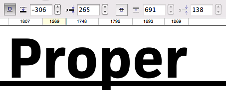
Underline and strike-through

For heavier fonts (here: FacitWeb bold), the underline weight is chosen to match the design. The crossbar of the e is a good visual reference. The position is chosen to strike roughly through the middle of the descenders and to leave an appropriate gap on the baseline.
Tim Ahrens for Typekit:
So far, foundries have had no reason to set these values in their desktop fonts carefully. But many browsers do adhere to these instructions, so they need to be evaluated and adjusted for web fonts.