Textiles and typographic texture
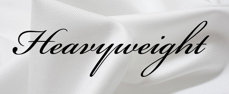
In Design with Type (pp. 30–31), Carl Dair explains how the dominant design characteristic of typefaces like Bickham Script is the “heavy slanted stroke”:
The repetition of the strong slanted line of the characters creates a pattern of diagonals throughout the line of type; this pattern is the texture of the type. And to emphasize how accurate the word texture is in describing this effect, consider the similarity between this type pattern and the dominant diagonal pattern in a twill weave. We have no difficulty in using the term texture for the cloth; it is just as applicable to type.
The relative coarseness of our typographic threads will thus affect the texture of our line in exactly the same way as in textiles; we can get a ‘silky’ line with Caslon Old Style and a ‘tweedy’ line with a Clarendon Bold.
 Shared by Tim Brown on June 23, 2015.