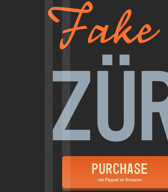
“Structured by type”

Tim Brown for Typekit:
Optical alignment is critical for compositions structured by type, and is often the difference between an amateurish composition and a professional-looking one. Above, the swash of the F in Fake aligns optically with the outer edge of the Z in Zürich. And the F’s lower stroke aligns optically with the purchase button underneath.
Plus a few other tips. Don’t miss the demo page.