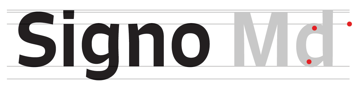
On the ‘floating effect’ of Signo
Rui Abreu, writing for I Love Typography:
The letters are heavier at the top, with more concentration to the right. This way, especially when set big, the letters seem to be lifted up slightly. The stems are also shaped to accentuate this effect, with some stems curving outwards at the top, while others shrink slightly in width towards the baseline.
 Shared by Tim Brown on May 30, 2014.