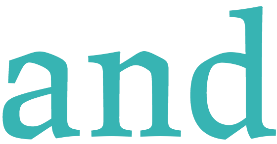
About face: JAF Lapture

Nick Cox, writing for Typekit:
Lapture’s letterforms exhibit an unmistakably historical tone, due in large part to their calligraphic leanings. Their unique blend of linear and carefully curved lines suggest a cut and carved aesthetic, but reference the pen slightly more than the counterpunch. Particularly notable is their gothic proportions, which call to mind a foreboding European cathedral.