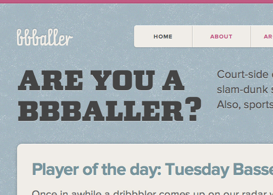
“Selectively use fonts with lots of character”

Meagan Fisher, writing for Typekit:
Display fonts are meant to be on display; cramming them into body text or tiny headlines will create an illegible mess. So be selective, and use ornate fonts at larger sizes. The striking slab serif used in bbballer gives a nod to varsity letter jackets, but it’s only used once in the design to avoid overpowering the content. It’s also set at a large enough size for the reader to enjoy all those thick serifs.