Reinforce visual hierarchy with contrast
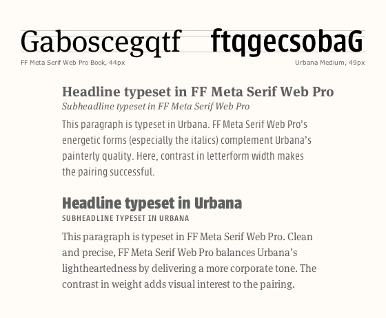
Letters set in FF Meta Serif and Urbana illustrate contrast. The two typefaces make a balanced but dynamic pair.
Aura Seltzer, writing for Typekit:
What are some reliable ways to evaluate contrast? Take a look at differences in weight, scale, spacing, and texture. [Typesetting] a composition with different sizes for headlines and paragraphs can give you a sense if there is enough difference.
 Shared by Tim Brown on January 08, 2014.