Finding balance in white space

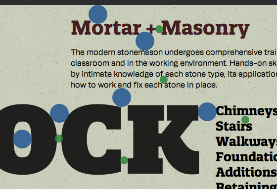
Blue and green dots identifying white spaces that resonate with one another’s volume.
Tim Brown, writing for Typekit:
Just as strokes and slabs in typefaces can inspire formal aspects of a composition, counters and crevices can inspire line-height, margins, and other white space. Quatro Slab’s weighty angles and sculpted nooks offer many opportunities for finding balance.