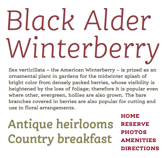
FF Ernestine from FontFont

Top to bottom: FF Ernestine Light Italic, Regular, Demibold Italic, Bold
Tim Brown, writing for Typekit:
Ernestine’s sturdy bounce, relaxed bends, and cheerful ball terminals give it a familiar and bright-eyed look. In all caps (and small caps) it looks both stately and playful. Available in four weights, each with an italic.