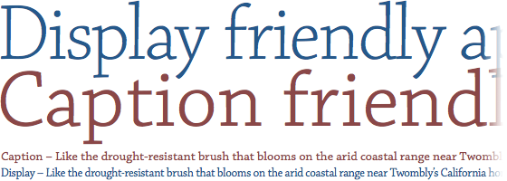
Chaparral Pro Display and Caption

Chaparral Display (blue) and Caption (red), at 90px and 14px.
Tim Brown, writing for Typekit:
Optical styles are each designed for a different range of sizes. Pound for pound, Chaparral Pro Caption is bigger, thicker, and more loosely spaced than Chaparral Pro Display because it is meant to be used at small sizes; its features are designed to look balanced and perform well at low resolution. The Display and Subhead styles, on the other hand, look great large, where their narrow, elegant forms have more pixels to breathe. Compare these specimens: Display Regular, Caption Regular.