Using shades for eye-catching emphasis 
In this lesson, we’ll style expressive display type in a way that emulates different sign painting techniques.
Knowing how to create drop shadows or create a three-dimensional look is important, but knowing when, why, and how to *shade letterforms* gives us reasons to style text that go beyond just wanting to make a heading look cool.
Sign painters have traditionally balanced form, color, and compositional contrast in lettering to direct attention, convey important information, and express specific qualities about an idea or thing. One essential, time-honored technique is to emphasize key words by shading them. Let’s look at several different kinds of shades, and how we can approximate them by adding effects to type.
Style
Drop shade
Many designers are familiar with the _drop shade_ technique. There is a clear separation between the text and its shade, as if the text is made of cut paper floating above a surface. When we make drop shadows with CSS, or with graphics editors, we can choose whether they look blurry or sharp. Sign painters’ drop shades are usually sharp.
See the Pen Drop shade example by Tim Brown (@timbrown) on CodePen.
.title em,
.title abbr {
  text-shadow: -.07em .07em $shade;
}
Note: Adjustments forthcoming.
Here, our text shadow is the same distance below the letterforms as it is to their left: .07em. What’s important here is not that the values are mathematically equal, but that the shade appears equally thick. Also note that our text shadow has no blur radius specified, so it is sharp by default.
CodePen is an HTML, CSS, and JS editor in the browser. Read more about using Typekit with CodePen.
Close shade

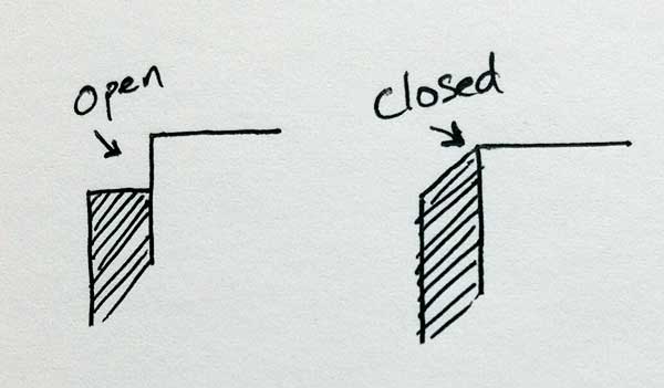
Unlike a drop shade, the _close shade_ is closed at its corners, which appears to give the letterforms thickness. Sign painters often include lighting effects too, varying the hue and value of a close shade’s colors depending on where the hypothetical light source is positioned. This can have a powerful effect when the close shade is in sync with natural sunlight that the sign receives.
See the Pen Close shade example by Tim Brown (@timbrown) on CodePen.
.title em {
  text-shadow:
    0 .005em $shade-bottom,
    -.005em 0 $shade,
    -.005em .010em $shade-bottom,
    -.010em .005em $shade,
    -.010em .015em $shade-bottom,
    -.015em .010em $shade,
    -.015em .020em $shade-bottom,
    -.020em .015em $shade,
    -.020em .025em $shade-bottom,
    -.025em .020em $shade,
    -.025em .030em $shade-bottom,
    -.030em .025em $shade,
    -.030em .035em $shade-bottom,
    -.035em .030em $shade,
    -.035em .040em $shade-bottom,
    -.040em .035em $shade,
    -.040em .045em $shade-bottom,
    -.045em .040em $shade,
    -.045em .050em $shade-bottom,
    -.050em .045em $shade;
}
Here, our two-tone close shade uses diagonally staggered text shadows in two different colors, so that the letters appear to have both dimension and lighting applied.
CodePen is an HTML, CSS, and JS editor in the browser. Read more about using Typekit with CodePen.
Offset
A shade is _offset_ when there is a visible gap between it and its text. The key to a successful offset shade is keeping the offset distance all around the letterforms optically balanced, in addition to maintaining a consistent thickness for the shade itself.
See the Pen Offset shade example by Tim Brown (@timbrown) on CodePen.
$background: #fff6e6;
$offset: $background;
.title em {
  text-shadow:
    -.010em .010em $offset,
    -.040em .040em $shade;
}
Here, we achieve an offset drop shade using two text shadow values — the first is nearer to the letterform and matches the page background color, so it looks like a gap between the text and the drop shade. If the background is not a solid color, this won’t work.
CodePen is an HTML, CSS, and JS editor in the browser. Read more about using Typekit with CodePen.
Direction
Printer’s shade

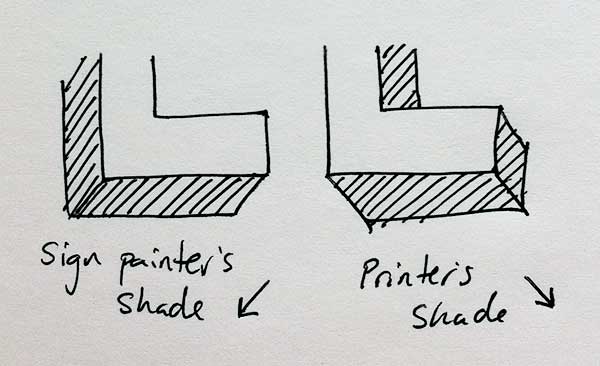
A _printer’s shade_, to the right and on the bottom of letters, is something sign painters only occasionally use — because shades on the right sides of letters generally take more brush strokes to achieve. This is not a problem for printers (or designers), and for that reason we don’t avoid it.
Most styles of sign painting shade appear to the left and on the bottom of letters; however, when the slope of letterforms is greater than 10 degrees, it should be shaded to the right — “unless doing so contradicts the shade direction already established in other parts of the graphic design” (another bit of wisdom from John Downer).
See the Pen Printer’s shade example (invisible secret) by Tim Brown (@timbrown) on CodePen.
.title:last-child {
  text-shadow:
    0 .005em $shade,
    .005em 0 $shade,
    .005em .010em $shade,
    .010em .005em $shade,
    .010em .015em $shade,
    .015em .010em $shade,
    .015em .020em $shade,
    .020em .015em $shade,
    .020em .025em $shade,
    .025em .020em $shade,
    .025em .030em $shade,
    .030em .025em $shade,
    .030em .035em $shade,
    .035em .030em $shade,
    .035em .040em $shade,
    .040em .035em $shade,
    .040em .045em $shade,
    .045em .040em $shade,
    .045em .050em $shade,
    .050em .045em $shade,
    .050em .055em $shade,
    .055em .050em $shade,
    .055em .060em $shade,
    .060em .055em $shade,
    .060em .065em $shade,
    .065em .060em $shade,
    .065em .070em $shade,
    .070em .065em $shade,
    .070em .075em $shade,
    .075em .070em $shade,
    .075em .080em $shade,
    .080em .075em $shade,
    .080em .085em $shade,
    .085em .080em $shade,
    .085em .090em $shade,
    .090em .085em $shade,
    .090em .095em $shade,
    .095em .090em $shade,
    .095em .100em $shade,
    .100em .095em $shade,
    .100em .105em $shade,
    .105em .100em $shade,
    .105em .110em $shade,
    .110em .105em $shade;
  }
Here, the combination of rotated, italicized type and a printer’s shade makes the type look like it is projecting outward from the background at an angle. If you edit the example on CodePen, try un-commenting the first text-shadow for a bright surprise.
CodePen is an HTML, CSS, and JS editor in the browser. Read more about using Typekit with CodePen.
Split shade
When there are two separate styles of shade applied to the same text, that’s called a _split shade_. Split shades can be stacked in a single direction or in two directions, and are often made to look as though three-dimensional text were casting a shadow.
See the Pen Split shade examples by Tim Brown (@timbrown) on CodePen.
.icecream em {
  color: $cookie;
  text-shadow:
    -.005em .010em $cookie,
    -.010em .005em $cookie,
    -.010em .015em $cookie,
    -.015em .010em $cookie,
    -.015em .020em $cookie,
    -.020em .015em $cookie,
    -.020em .025em $cookie,
    -.025em .020em $cookie,
    -.025em .030em $cookie,
    -.030em .025em $cookie,
    -.030em .035em $cookie,
    -.035em .030em $cookie,
    -.035em .040em $vanilla,
    -.040em .035em $vanilla,
    -.040em .045em $vanilla,
    -.045em .040em $vanilla,
    -.045em .050em $vanilla,
    -.050em .045em $vanilla,
    -.050em .055em $vanilla,
    -.055em .050em $vanilla,
    -.055em .060em $vanilla,
    -.060em .055em $vanilla,
    -.060em .065em $vanilla,
    -.065em .060em $vanilla,
    -.065em .070em $vanilla,
    -.070em .065em $vanilla,
    -.070em .075em $vanilla,
    -.075em .070em $vanilla,
    -.075em .080em $vanilla,
    -.080em .075em $vanilla,
    -.080em .085em $vanilla,
    -.085em .080em $vanilla,
    -.085em .090em $vanilla,
    -.090em .085em $vanilla,
    -.090em .095em $vanilla,
    -.095em .090em $vanilla,
    -.095em .100em $vanilla,
    -.100em .095em $vanilla,
    -.100em .105em $vanilla,
    -.105em .100em $vanilla,
    -.105em .110em $vanilla,
    -.110em .105em $cookie,
    -.110em .115em $cookie,
    -.115em .110em $cookie,
    -.115em .120em $cookie,
    -.120em .115em $cookie,
    -.120em .125em $cookie,
    -.125em .120em $cookie,
    -.125em .130em $cookie,
    -.130em .125em $cookie,
    -.130em .135em $cookie,
    -.135em .130em $cookie,
    -.135em .140em $cookie;
}
.shaveice em {
  color: $ice-top;
  letter-spacing: .08em;
  text-shadow:
    -.005em .010em $ice-inner,
    -.010em .005em $ice-inner,
    -.010em .015em $ice-inner,
    -.015em .010em $ice-inner,
    -.015em .020em $ice-inner,
    -.020em .015em $ice-inner,
    -.020em .025em $ice-inner,
    -.025em .020em $ice-inner,
    -.025em .030em $ice-inner,
    -.030em .025em $ice-inner,
    -.030em .035em $ice-inner,
    -.035em .030em $ice-inner,
    -.035em .040em $ice-inner,
    -.040em .035em $ice-inner,
    -.040em .045em $ice-inner,
    -.045em .040em $ice-inner,
    -.045em .050em $ice-inner,
    -.050em .045em $ice-inner,
    -.050em .055em $ice-inner,
    -.055em .050em $ice-inner,
    -.055em .060em $ice-inner,
    -.060em .055em $ice-inner,
    -.060em .065em $ice-inner,
    -.065em .060em $ice-inner,
    -.065em .070em $ice-inner,
    -.060em .065em $ice-shadow,
    -.060em .075em $ice-shadow,
    -.055em .070em $ice-shadow,
    -.055em .080em $ice-shadow,
    -.050em .075em $ice-shadow,
    -.050em .085em $ice-shadow,
    -.045em .080em $ice-shadow,
    -.045em .090em $ice-shadow,
    -.040em .085em $ice-shadow,
    -.040em .095em $ice-shadow,
    -.035em .090em $ice-shadow,
    -.035em .100em $ice-shadow,
    -.030em .095em $ice-shadow,
    -.030em .105em $ice-shadow,
    -.025em .100em $ice-shadow,
    -.025em .110em $ice-shadow,
    -.020em .105em $ice-shadow,
    -.020em .115em $ice-shadow,
    -.015em .110em $ice-shadow,
    -.015em .120em $ice-shadow,
    -.010em .115em $ice-shadow,
    -.010em .125em $ice-shadow,
    -.005em .120em $ice-shadow,
    -.005em .130em $ice-shadow,
    .000em .125em $ice-shadow,
    .000em .135em $ice-shadow,
    .005em .130em $ice-shadow,
    .005em .140em $ice-shadow,
    .010em .135em $ice-shadow,
    .010em .145em $ice-shadow,
    .015em .140em $ice-shadow,
    .015em .150em $ice-shadow,
    .020em .145em $ice-shadow,
    .020em .155em $ice-shadow,
    .025em .150em $ice-shadow,
    .025em .160em $ice-shadow,
    .030em .155em $ice-shadow,
    .030em .165em $ice-shadow,
    .035em .160em $ice-shadow,
    .035em .170em $ice-shadow;
}
Note: Adjustments forthcoming.
In the “ice cream” example, we sandwich a stack of vanilla text shadows between smaller stacks of cookie-colored text shadows that match the color of the text itself.
In the “shave ice” example, about halfway through the stack of text shadow values, we stop making our shade look like the “inner” thickness of the icy letters and start making it look like the shadow those letters are casting. We do this by changing color and reversing horizontal direction (the first number in each value) but continuing downward with the shade’s vertical increments.
CodePen is an HTML, CSS, and JS editor in the browser. Read more about using Typekit with CodePen.
Talking about shades
When we describe shades, we combine these words. For example, we could talk about an offset drop shade (like our [Spring example above](#example3)), or a close printer’s shade (like [Footquarters](#example4)). How would you describe the shade on the word “Shades” in [the title of this lesson](#top)?
Exercises
Now it’s time to practice. Try any of the examples above by editing them on CodePen — each example has an [“Try on CodePen” button](#example2). Adjust the markup and style to see how different conditions affect a shade. You can even fork the Pens and try different fonts (read more about [using Typekit with CodePen](http://help.typekit.com/customer/portal/articles/1510698-using-typekit-with-codepen)).
Then, show other people what you make. Sharing results in a better understanding of our design decisions, and can lead to new ideas. Tweet about your forked Pens, post screenshots on Dribbble or Behance, and [let us know when you do](http://twitter.com/typekit). The Typekit team is full of designers and developers. We love talking about work, answering questions, and listening to ideas.