Getting the most out of type specimens 
In this lesson by Aura Seltzer, we’ll evaluate type specimens for web fonts — and turn those artful arrangements of glyphs, styles, and weights into design tools.
Type specimens have long served as one of the most reliable tools by which we evaluate typographic options. Since the 15th century, printing houses, type designers, and (more recently) web font services have used specimens to showcase their offerings. But they’re more than just sales tools; specimens provide a glimpse of a typeface’s rendered qualities and stylistic capabilities, all while highlighting the nuances of its letterforms.
Before digital typesetting, designers relied on specimens to help estimate how much typeset text could fit into a specified area. While a type specimen on the web is free from many of the limitations of its print predecessors (paper absorbency, printer quality), its native environment brings new constraints: file size concerns, no set dimensions, and varied rendering engines.
Today’s most useful web type specimens go beyond making text look beautiful; they set us up for success. Their inspiring content helps us survey styling options and examine type at a variety of appropriate sizes, and we can preview the output in different settings. These specimens call upon us to stop looking and start making.
No matter where you are in your process, these four objectives will help you get the most out of type specimens from foundries, begin crafting your own type specimens, and use both to make confident typographic decisions in your work.
Use considered, inspiring content
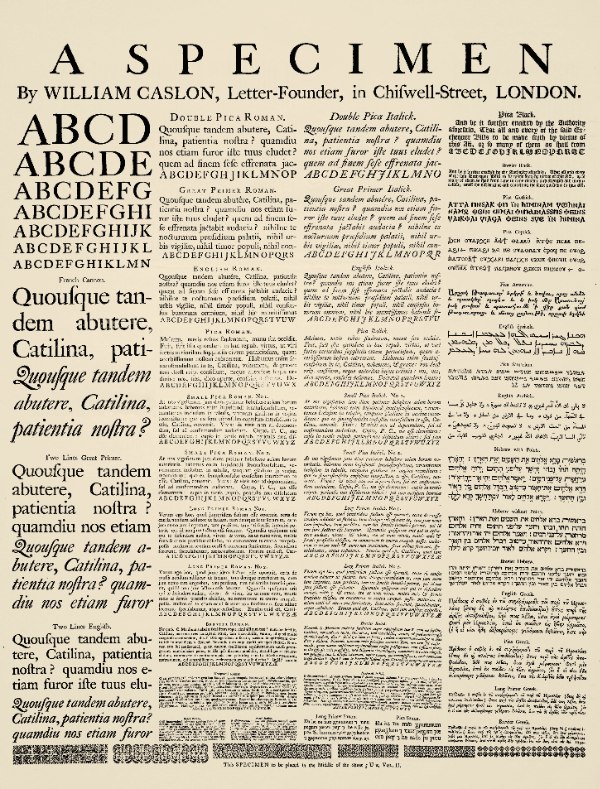
Before the days of the web, specimens were printed on pages, typically bound together in a book. Many early specimens set their fonts using Latin text, like the opening remarks of Cicero’s Catiline Orations: “Quo usque tandem abutere, Catilina, patientia nostra?” Printers and type designers also relied on alphabetized uppercase and lowercase character sets, which enabled viewers to examine a font’s letterforms without getting caught up in meaning.
Latin text, pangrams, and sequential alphabet sets still pervade the language of web specimens today. But these approaches are misguided for our needs; we should want to read a specimen’s content. After all, we’re looking to select typefaces that encourage our users to do the same. We shouldn’t make decisions in the context of unrealistic typesetting expectations.
To better imagine how a font will function outside the life of a specimen, look for examples – or create your own – that both present the characteristics of a font and carefully select language to evoke its sensibility. With well-considered content in place, you’ll be able to focus on the shapes of the letterforms and decide whether they represent the personality of the voice you’re trying to evoke. If a specimen conveys this voice clearly, you’ll be better equipped to assess its fit for your content.
Styling meaningful, relevant content may mean you’ll have to devise at least an idea of what your website’s content will be before you try to select your typographic palette — but that definitely doesn’t mean all of your final content has to be ready. Let’s say you’re designing a website for a local burger spot called The Bun Shop, which prides itself on a selection of tasty toppings and side dishes. You could jump into the browser or a test-driving tool like Typecast, and start by evaluating how a specimen would treat those menu items. If your chosen words happen to also accentuate and align with the unique parts of the font’s letterforms, you’re headed in the right direction.
Here’s how we might start playing around with The Bun Shop site’s typography. We’ll try out Alpha Echo for a big, spunky header, and De Walpergen’s Pica for the menu text.
CodePen is an HTML, CSS, and JS editor in the browser. Read more about using Typekit with CodePen.
Survey styling options extensively (and practically)
After you get a feel for a specimen’s content, assess how that specimen demonstrates the various settings of a typeface. You’ll have already looked at the shapes of the letterforms in the context of some real-ish content, so it’s now time to pay attention to the use cases for which you haven’t tested.
Keeping with our burger theme, let’s say The Bun Shop’s chef also posts recipes to the site — specifically, recipes celebrating his German heritage. You could first test for whether your chosen font has German language options, then also check for special characters frequently used in recipe instructions, like fractions and a degree symbol.
Be judicious when unlocking extra features for more styling options. Just because a glyph, style, or weight is available doesn’t mean you have to use it — or require that your users load it. You can still show off savvy typography without compromising your site’s performance.
De Walpergen’s Pica feels even more refined with these additional glyphs in play, contrasting well with the heading’s grit. However, the additional glyphs do add to the weight of the page.
CodePen is an HTML, CSS, and JS editor in the browser. Read more about using Typekit with CodePen.
Examine type at a variety of appropriate sizes
Chances are, your design won’t call for only one size of type. Using a range of type sizes enhances hierarchy and carries the eye through your content, and specimens can help you assess whether a font is appropriate at the sizes your design needs.
When it comes to presenting type at different sizes, many specimens lay out a font in a successive, regimented scale — a waterfall. This approach has evolved from punch-cutting days, when text was only shown at the sizes in which the font was available, and it continues to be very useful: web font specimens that include waterfalls plainly show a font at various sizes, so that we can see how it renders and decide on the sizes at which a font will look its best.
By laying out De Walpergen’s Pica in a waterfall of sizes, we can get a sense for how much space the same line of text occupies as it scales up. And we can gauge how the type size feels: the text becomes difficult to read when the font is set smaller than 14px; setting the font at larger sizes accentuates the letterforms’ old punches and “inkiness” on screen.
CodePen is an HTML, CSS, and JS editor in the browser. Read more about using Typekit with CodePen.
With many specimens today, size may not be presented at distinct values or sequenced as a waterfall from largest to smallest setting. Stacked lines of justified text might alternate with more random sizes to create a more balanced visual design. This approach places emphasis on the overall gestalt of the layout and can give a better sense of how a variety of text sizes will interact. You can easily build your own justified, stacked specimens on the web with a plugin like FitText.js, or with CSS viewport units, which allow us to create scalable headlines that fit the width of their parent elements.
Whether a specimen is laid out as a waterfall or alternates sizes across its design, it’s the range of sizes that’s worth studying. Some typefaces are constructed explicitly for legibility at small sizes and others decidedly for display purposes — good specimens impart this by example.
Preview your final output in different settings
Study your specimens in every context you care about. You want to ensure your users benefit from all the effort you’ve put into type selection, no matter how they view your design. Load them up on different devices. Point a service like Browserstack to them. Are glyphs still legible? Are shapes and weights consistent, and distinct enough from one another?
This can be hard to judge, because some specimens are presented as raster graphics or SVGs. If the specimen is a raster graphic, alternate browser views are crucial to managing expectations for quality and legibility. SVGs are scalable, crisp, resolution-independent, and their text can be tailored with CSS. But, on top of limited cross-browser support, this unaliased file format often puts forward an idealized state of the letterforms.
Exercises
Practice looking at — and making — specimens with some of these more nuanced goals in mind. Imagine that instead of a burger joint, you’re considering typefaces for a personal blog: a serifed typeface for the headers, and a sans for the body text. Try our first example on CodePen, changing the fonts and the text. What sizes will you try out? How many different styles and weights? What text will you use to evoke the fonts’ sensibilities?
Next, try our second and third examples on CodePen as well. Update them with the fonts you’ve chosen for this hypothetical personal blog. Survey your fonts’ styling options, and review rendering at a variety of sizes. Look at all of your specimens in different settings, and share your thoughts about whether or not you think the type will work.
 Shared by Aura Seltzer on November 25, 2014.
About our guest author

Aura Seltzer is a Designer at Happy Cog and holds an MFA in Graphic Design from Maryland Institute College of Art. She’s also a habitual list maker and a wannabe foodie with an uncontrollable sweet tooth. When the mood strikes her, she tweets from @auraseltzer.